 Flowo
Flowo
Brand kit — Flowo
Reference for logo, colours, and UI mood: dark sidebar, bright calendar, purple actions, soft task chips. Use this page to keep marketing and product visuals aligned.
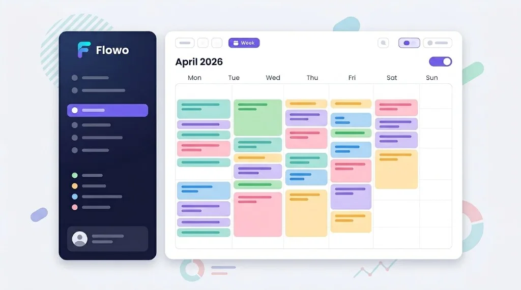
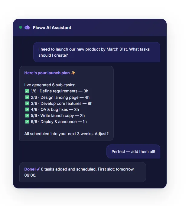
Product snapshot
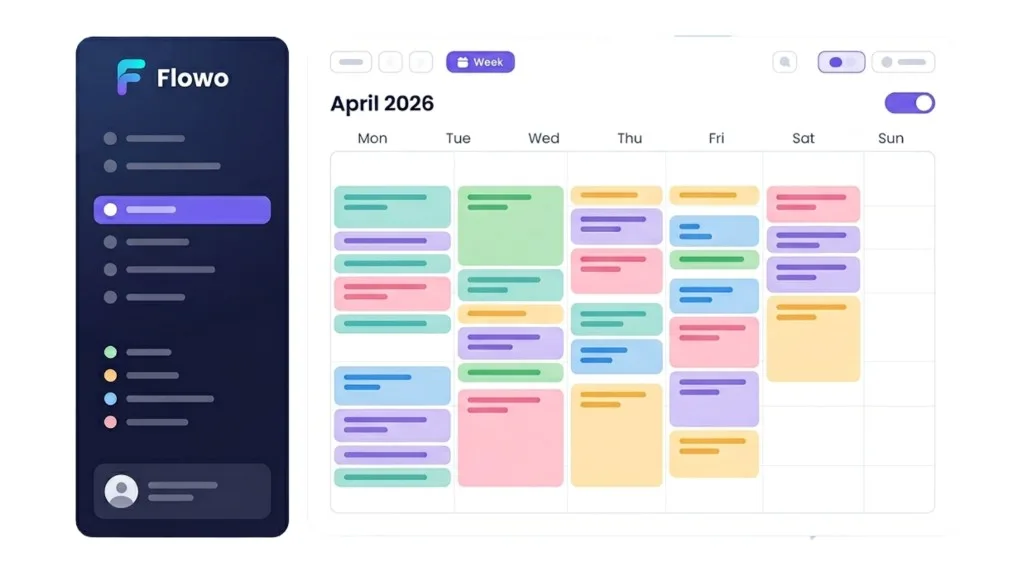
Hero mockup (reference)
Primary illustration for the landing hero: week view with pastel blocks on a light canvas and a deep navy navigation rail.
Mission
Flowo mission statement
Flowo exists to remove planning friction and decision fatigue, so people can spend less time organizing and more time executing meaningful work. We design for clarity, momentum, and confidence — especially for ADHD and high-context-switch users.
Colour
Core palette
#0F172A#5B50F5#06B6D4#F8FAFCSchedule chips (examples)
Pastel fills for calendar tasks — keep contrast readable on white.
#99F6E4#7DD3FC#DDD6FE#FECDD3#FED7AAColor usage rules
- Primary actions: use purple gradient (
#5B50F5 → #7C6AF7) for main CTA buttons only. - Text hierarchy: dark navy for titles, muted slate for secondary copy; avoid pure black on white.
- Status and chips: pastel fills for task cards, always with readable dark text.
- Backgrounds: keep main canvases light (
#FFFFFF,#F8FAFC) and reserve dark navy for app shell/sidebar contexts. - Do not: add random new accent colors; map new visuals to existing token palette first.
CSS tokens (site)
| Token | Role |
|---|---|
--accent | Primary purple for links, focus, key buttons |
--grad | Hero buttons and highlights (purple → violet) |
--text / --muted | Body copy hierarchy |
--pd-bg (app) | Dark panels / planner chrome |
In code, prefer existing variables from public/app.css and landing inline styles rather than hard-coding new hex values.
Logo
Wordmark & icon
Default: full colour on light; white / light mark on dark backgrounds.
- Do not stretch, recolour the gradient mark, or add outlines not in source files.
- Minimum clear space: height of the “o” around the logo.
Branding kit assets
Logos PNG (transparent background)
All files below are directly reusable in social posts, slides, videos, and partner pages. Transparent PNG only.

Core icon set
Transparent icons used across landing and product
Complete mapping source: /flowo-landing/icons-metadata.json (keywords + usage intent).
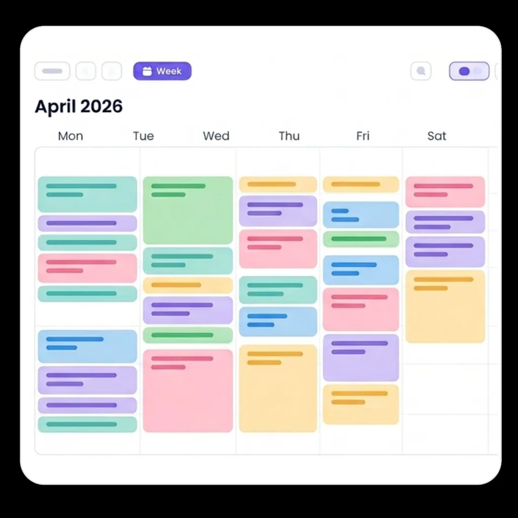
Illustrations used
Transparent/hero-ready visual assets
Typography
Inter
Primary family for Flowo marketing: Inter. App UI shell mostly uses system-ui fallback stack for speed, but all marketing and brand assets should follow Inter scale below.
| Level | Size / weight | Usage |
|---|---|---|
H1 | 48-64px · 700/800 · letter-spacing -0.03em to -0.04em | Hero title, key campaign headlines |
H2 | 32-44px · 700 · letter-spacing -0.02em | Section titles, major value props |
H3 | 22-30px · 600/700 · letter-spacing -0.01em | Card titles, sub-sections |
Subtitle | 18-22px · 500/600 | Supporting statements under headers |
Body | 15-18px · 400/500 · line-height 1.6-1.7 | Main explanatory text |
Caption | 12-14px · 500/600 | Meta labels, helper copy, UI hints |
CTA | 14-16px · 600/700 | Buttons and action links |
Voice & extra guidelines
- Clear, confident, human — explain the benefit before the feature.
- Neuroscience and ADHD-friendly positioning without clinical jargon in headlines.
- CTAs: action + outcome (“Start free trial”, “Open app”).
- Show the product as calm and structured: avoid noisy compositions or too many competing badges.
- Prefer realistic UI captures over abstract mockups when explaining feature value.
- Always keep message order: pain → simplification → proof/value → CTA.
Contact
Questions about the brand: hello@getflowo.com